This article highlights Taylor Swift font styles which are an attraction for a lot of people. Taylor Swift, the American singer and songwriter, is widely known throughout the world for her one-on-one songs. And it is not just her songs that capture the hearts but also the covers of her albums that catch the eye of millions of her fans. Undoubtedly, every element including the font she uses is very carefully curated.
From the album cover of “Speak Now” to “Folklore”, the fonts that she has used have reflected the changing phases of her life as well as her artistic vision. Not only her songs but also her album covers and fonts have a story to tell. So let’s talk about the different Taylor Swift font which is a topic of interest for many.
In her early days, Taylor’s songs showcased youthful enthusiasm, and her fonts reflected that. Her debut album, “Fearless,” featured the bubbly and friendly “Carla Sans Light,” a font that captured the carefree spirit of teenage love and heartbreak.
In her next album “Speak Now”, she used the font “Sudestada” which looks handwritten. This font style fits with the fairytale-inspired theme of the album and adds a touch of playfulness to it.
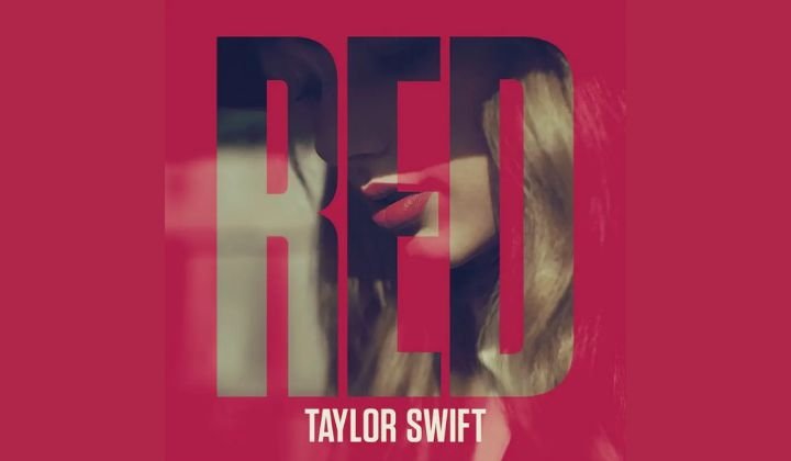
As time passed, Taylor gained more confidence and maturity which was clearly visible from the fonts that she used in her later albums. In her album “Red”, she used the font “Tungsten Condensed”. This sleek and modern style very well depicted her confident and powerful version.
Taylor Swift has even used her own handwriting in the covers of her songs which made her fans feel more connected to her. In the album cover for “1989” she chose her own handwriting as the font which invited fans into her personal world.
Taylor Swift font has never failed to mirror the theme of her songs. In her album “Lover,” the playful and romantic “Satisfy” font reflected the album’s themes of love and self-acceptance.
With “Folklore” and “Evermore,” Taylor Swift set on a journey of introspection and storytelling. “IM Fell DW Pica” was used in both albums, a font with a slightly imperfect, hand-printed style that evoked a sense of resilience and growth as did the lyrics of the songs.
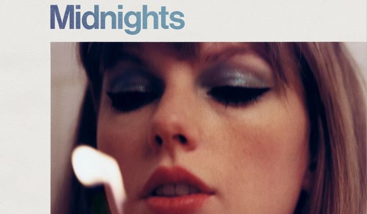
Taylor’s latest album, “Midnights,” uses the font called “Neue Haas Grotesk.” This clean and modern font exhibits a sense of mystery and sophistication, which hints at the hidden truths and stories explored in the album.
All the different fonts and details that Taylor Swift has used show us that she is very particular about each detail and even the smallest element of her work matters to her. We greatly admire her artistic vision and her dedication towards her work. No doubt, Taylor has impressed her fans and never let them down.
Also read: Is Taylor Swift Overrated?
